TL;DR
Soft warm whites, gentle greige, pale earthy tones, and low-contrast palettes are the colors that make small kitchens feel notably larger and calmer. Human expertise ensures the subtle adjustments and practical color choices that create kitchens both restful and realistic, not just visually bright.
The Real Reason Small Kitchen Colors Matter

Expert small kitchen color ideas, including low contrast greige cabinets and subtle best backsplash colors for small kitchens, reveal how to make a small kitchen look bigger with color and create a visually restful, spacious-feeling design.
If you’ve painted your small kitchen a lighter color but it still feels cramped, you’re not alone. Brightness alone does not always make a kitchen feel bigger. Sharp contrast, busy surfaces, heavy shadows, and cold lighting can still make compact spaces feel visually tiring.
The small kitchens that feel most open are usually the ones that feel calm first. Thoughtful choices around color, undertones, and visual balance often matter more than trendy paint shades. As explored in our guide on small space design ideas that make your home feel bigger, the most successful compact spaces are designed around comfort and flow, not just appearance.
-
1. Soft Warm Whites: More Restful Than Sharp Bright Whites

Best small kitchen color ideas use creamy warm whites for a calming, expansive feel. Discover how to make a small kitchen look bigger with color and low contrast palettes.
Many think bright white will make a small kitchen bigger, but extremely cool whites can create harsh glare and visual fatigue, especially at night or under cool LED lighting. Human designers choose creamy whites, warm ivory, or soft off-whites that soften corners and blend surfaces gently. This makes the room not just brighter, but calmer and more comfortable, a lesson plenty of homeowners miss when DIY-ing. As we explored in our kitchen staging ideas blog, expert-selected shades are critical for a welcoming feel.
Expert Insight
A real estate agent recently painted her small kitchen a traditional bright white, expecting instant spaciousness, but late evening made the room feel colder and less inviting. Once she switched to a soft warm white and muted backsplash, the kitchen felt larger and her listing photos looked more inviting to buyers.
-
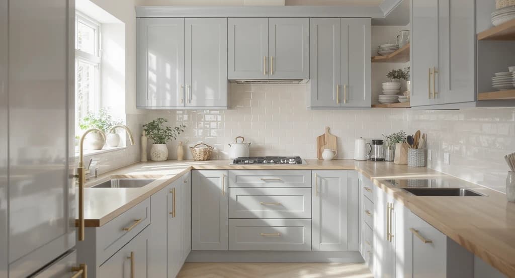
2. Warm Greige Creates Softness Without Making Spaces Dark

Warm greige cabinets and a soft stone backsplash showcase the best small kitchen color ideas to make a small kitchen look bigger. Low contrast palettes, as shown here, add softness and keep the space feeling open and inviting.
Online, cool gray cabinets look fresh, but in person they can flatten warmth and feel more closed in—especially in small kitchens. Human experts prefer warm greige (a mix of gray and beige), mushroom, and soft stone hues that reflect changes in daylight and add a sense of softness. This expertise means your space stays light without ever feeling cold or bland.
-
3. Pale Earthy Colors Calm Busy Kitchens

Muted earth tones like sage, dusty olive, and pale ochre are among the best small kitchen color ideas. These gentle, low contrast palettes help make a small kitchen look bigger and create a soothing, clutter-free space.
Muted earth tones like sage, dusty olive, or pale ochre have a special grounding effect. Experienced designers use these shades to reduce mental clutter and stress in compact kitchens. The key is subtlety: gentle color helps a small space breathe, while loud patterns make it feel even smaller. That’s the difference between a kitchen that feels like a retreat and one that feels like a rush.
-
4. Low-Contrast Palettes Keep Small Kitchens Feeling Open

A seamless, low-contrast palette of beige, gray, and off-white shows how to make a small kitchen look bigger with color. These best small kitchen color ideas—including a matching backsplash—help create an open, airy space.
Too many sharp contrastslike white tile with black grout, thick dark countertops, or high-contrast flooring can break a small kitchen into visual fragments, making it feel more cramped. Human designers know that blending cabinetry, countertops, and backsplashes with soft contrast gives the space continuous visual flow, helping it read as open and connected. For specific approaches, see our advice on low-contrast palettes for small kitchens.
-
5. Lighter Upper Cabinets Raise Visual Ceilings

Light-reflective upper cabinets paired with darker base cabinets use one of the best small kitchen color ideas for maximizing visual height—showing how to make a small kitchen look bigger with color and low contrast palettes.
Cabinets play a big part in how high or heavy a kitchen feels. Dark uppers quickly lower the visual ceiling, concentrating shadows and making the space shrink, especially after sunset. Professionals keep upper cabinets and open shelves light and reflective, drawing the eye upward and making the whole room feel less boxed in. If deeper colors are used, they're reserved for lower sections where they ground rather than crowd the space.
-
6. Satin Finishes Balance Light and Shadow
Ultra-matte paints and cabinets have gained popularity for their look in photographs, but they often trap shadows in real kitchens, making corners disappear and the whole room feel tighter. Styldod editors suggest soft satin finishes, they reflect light gently without causing glare and keep the room feeling luminous but forgiving. It’s a subtle choice human eyes pick up on immediately.
-
7. Simpler Backsplashes Make the Space Cleaner
Backsplashes with busy patterns, heavy grout, or too much color tend to overwhelm small kitchens. Professional stylists tone it down with simple shapes, lighter grout, and soft reflective tiles creating a calm, expansive look that’s easier to keep clean both visually and practically. This insight comes from experience staging countless kitchens to optimize buyer trust and simplicity.
-
8. Consistent Warm Undertones Feel Inviting
When undertones clash such as icy white shelves with warm walls, the kitchen feels visually disjointed. Experts know to match undertones, keeping warm with warm or muted with muted. This subtle design discipline creates a steady, inviting mood throughout, even if you change the main palette season to season.
-
9. Calm Comes Before Style in Truly Great Small Kitchens
Real-world staging experience shows that the best small kitchens aren’t only photogenic, they’re restful, easy to move through, and simple to maintain. Human designers prioritize function and ease, choosing colors that reduce visual stress and support natural light. The result: a space that welcomes people emotionally and practically.
Visualization Scenario
Picture opening a kitchen door and seeing creamy cabinets, pale stone counters, and a soft sage accent wall, all blending seamlessly. The room feels bright, open, and calm, with no surfaces that demand attention or lines that chop up the view. Instead of being distracted by sharp contrast, your eyes relax, and the kitchen feels ready for everyday life.
Frequently Asked Questions: Small Kitchen Colors
What colors make a small kitchen look bigger?
Soft warm whites, gentle greige, pale earthy hues, and low-contrast neutral palettes create a more open and comfortable feeling.
Is white always the best color for a small kitchen?
No. Ultra-bright whites can feel stark. Warm, creamy whites usually work better, as mentioned in our kitchen staging tips.
Do dark cabinets work in small kitchens?
Dark lower cabinets are fine as long as upper cabinets remain light, letting the kitchen stay airy.
What kind of backsplash is best in a compact kitchen?
Simple backsplashes with lighter grout and soft patterns feel much more spacious than busy designs.
Why does undertone matter in kitchen colors?
Color undertones (warm vs. cool) influence comfort. Consistent warm undertones usually feel more welcoming in small kitchens.
Key Takeaways: Small Kitchen Color Choices That Work
The best small kitchen colors are about more than brightness, they’re about how the space makes you feel. Creamy whites, warm greiges, earthy tones, and soft contrasts make kitchens appear bigger because they invite comfort and clear mental clutter. Expert input matters because it turns color choices into cohesive, trustworthy spaces, helping your kitchen work not just in photos, but in everyday life. When you want your kitchen to feel both open and livable, human expertise bridges the gap between visual theories and rooms people genuinely enjoy.


