TL;DR
Sleep quality has more to do with how colors interact with light, undertones, and the rest of your decor than with picking a popular color. Human observation and careful bedroom planning make the real difference in creating restful spaces that support better sleep.
Why Color Alone Can’t Guarantee a Restful Bedroom

Choosing the best bedroom color for sleep means considering both paint undertones and how lighting affects color. Avoid mistakes with bedroom color schemes by factoring in visual clutter and creating a truly restful design.
Ever wondered why a bedroom painted with the latest trending color still feels off at bedtime? Many people blame the paint, but the real culprit is usually something deeper: how the color interacts with light, undertones, and even the objects in the room. According to our guide on creating calm and functional modern bedrooms, the best sleep spaces are about much more than just picking a 'calming' wall color. People respond to how a space feels as a whole, not just the color on the walls. Color, lighting, contrast, and clutter all play a role in how relaxed you feel at night. If you want your bedroom to support good sleep, it helps to think like a professional who considers the entire picture, not just a paint swatch.
-
1. A "Calming" Color Can Still Feel Stressful If the Undertones Are Wrong

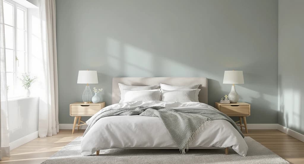
Selecting calming bedroom paint undertones is crucial: this image shows how bedroom lighting affects color perception and restful design, helping avoid mistakes with bedroom color schemes for sleep.
It’s easy to choose a popular calming color and still not get the relaxing effect you want. The hidden culprit? Color undertones. For example, a beige picked for its warmth may feel surprisingly energetic if it contains strong yellow notes. Meanwhile, a cool gray-blue can feel soothing in a sunlit room but turn icy in dim light.
Why does this matter? Because undertones change as your room's lighting shifts from day to night, and that can affect how calm you feel when it's time to sleep. Sampling paint at different times of day, as we explored in our coastal bedroom design guide, is a smart way to make sure your color still works when the lights dim.
Expert Insight
One client chose a gray-blue that looked perfect in a magazine but turned chilly and gloomy in their shaded bedroom. After trying a few samples in their own light, they found a warmer beige that finally felt inviting when it was time to unwind.
-
2. The Best Sleep Colors Are Usually the Least Demanding on Your Eyes

Muted shades like dusty blue and pale sage create a restful bedroom by minimizing visual clutter—demonstrating the best bedroom color ideas for sleep. Choose calming paint undertones and avoid common mistakes with busy color schemes.
High-saturation colors draw attention, even in low light making it difficult for your brain to wind down. Muted shades like dusty blue, pale sage, or soft lavender are less visually busy, letting your mind relax.
What’s the practical takeaway? Focus on the gentler, softer paint options. These tend to get overlooked in favor of bold, photo-friendly colors, but their subtlety pays off at night according to our article on how to stage a bedroom. -
3. Why Pure White Bedrooms Often Feel Less Relaxing at Night
White seems like a safe choice, but pure or cold whites bounce more light around the room, making spaces feel harsh especially under bright artificial lighting. At bedtime, this can prevent your brain from relaxing, leading to a more alert (and less sleepy) mood. Soft off-whites, creamy whites, or warm whites create a gentler backdrop without making things feel stark.
-
4. The "Showroom Effect" Makes Many Bedroom Colors Fail at Home

Bedroom paint colors often look perfect in showrooms but change dramatically in real-world lighting and everyday settings. Evaluate bedroom color schemes at home with your actual lighting and decor to find the best bedroom color ideas for sleep and avoid common mistakes.
Paint colors often look beautiful in magazines, showrooms, or social media, but don’t always translate to restful spaces at home. Why? Most displays are staged without everyday objects, wires, and mixed-in clutter.
What to do: Always judge colors in your actual space, with your real bedding, lighting, and decor. This is critical for realistic outcomes, as we discussed in our guide on minimalist bedroom design. -
5. Visual Noise Often Disrupts Sleep More Than the Paint Color
Many people blame the wall color when the true problem is too many clashing features. Busy art, mismatched finishes, and bold accents create visual clutter and your brain keeps processing all of it, even as you try to fall asleep. For truly restful bedrooms, limit the palette to two or three main colors and keep decor minimal, as shown in our post about minimal bedroom ideas.
-
6. Strong Contrast Can Make a Bedroom Feel More Alert
It’s not just color, but also the jump between colors that can make a room feel busy. Sharp contrast like jet black beside bright white draws the eye, making it hard to relax. Bedrooms that feel restful use softer transitions, often with several shades within the same color family. This thoughtful blending is a key reason why hotel suites feel so calm something a human designer plans for from the start.
-
7. The Best Bedroom Color Depends on the Light You Already Have

Bedroom color choices should reflect how natural light direction impacts paint shades. Selecting calming undertones and minimizing visual clutter are key bedroom color ideas for sleep and avoiding common color scheme mistakes.
Natural light direction changes how colors look and feel. North-facing rooms can make cool tones feel chilly, while sun-drenched spaces let blue and green shades shine. If your room has little daylight, choosing warmer colors like beige or taupe may counteract any gloom. Always test your colors in your specific light before finalizing, as emphasized in our modern bedroom ideas for 2026.
-
Bonus: Which Bedroom Colors Usually Support Better Sleep?
- Dusty Blue: Visually calming and associated with lower stress.
- Pale Sage Green: Feels grounded and natural.
- Soft Lavender: Offers calm with a touch of warmth.
- Warm Beige: Cozy and familiar, especially in shadowy spaces.
- Taupe: Adds gentle warmth without overstimulation.
- Powder Pink: Creates softness without being too energetic.
-
Colors to Handle with Care: Less Sleep-Friendly Choices
- Bright Red: High energy and attention-grabbing.
- Bold Orange: Visually stimulating and can feel disruptive at night.
- Intense Yellow: Mentally activating.
- Stark White: Can feel harsh under artificial lighting.
Visualization Scenario
Imagine stepping into a bedroom painted soft sage, evening light creating gentle shadows. The bedding and curtains are in muted colors, art kept simple. Without any bold contrasts or busy patterns, the whole room feels naturally peaceful, helping your mind switch off before bed.
Frequently Asked Questions
Why does my bedroom color look different at night?
Artificial lighting changes color appearance. Undertones become more noticeable after sunset, which can shift the mood of a space.
Can the wrong undertone make a room feel colder?
Yes. Cool undertones may make dark rooms seem less inviting, even with calming main colors.
Why does a calming bedroom still feel busy?
Visual clutter from patterns, decor, or strong contrasts distracts the mind more than the paint color itself.
Is sage green better than blue for sunny rooms?
Both work well, but sage green especially feels balanced in rooms with lots of daylight.
Should wall colors match bedding?
No need for an exact match. Aim for colors within a coordinated palette that feels consistent.
What matters most when choosing a bedroom color?
How the color feels in your actual room, at the time and light level you use it most.
What Matters Most (And Why Human Judgment Still Wins)
Creating a restful bedroom is about more than following color trends or copying inspiration photos. The spaces that truly support sleep are built around calming undertones, the right contrast, gentle lighting, and minimal visual clutter. These are details designers agonize over, because people react not just to the look, but to the feeling a space provides at bedtime. Incorporating professional insight into your color and layout choices can mean the difference between restless nights and a bedroom that really helps you relax. For homeowners, property marketers, and real estate agents, these subtle details not only improve daily comfort but can also increase listing appeal and buyer confidence.


